
To elevate your cosmetic packaging branding, use vibrant colors to evoke emotions and attract attention. Red for passion, soft pastels for femininity, and green for eco-friendliness can enhance consumer appeal. Pair these colors with fonts that reflect your brand’s personality—serif for sophistication, sans serif for modernity, or script for elegance. Thoughtful combinations and a strong typography hierarchy make a lasting impression. Keep exploring to find perfect styles that resonate with your audience.
Key Takeaways
- Choose serif fonts for sophistication or sans serif for a clean, modern appeal that aligns with your brand’s identity.
- Utilize vibrant colors like fuchsia and teal to evoke energy, or soft pastels for a gentle, feminine touch.
- Combine bold typography for attention with playful lettering to attract younger demographics and infuse fun into your packaging.
- Prioritize sustainable materials in packaging design to appeal to eco-conscious consumers while enhancing brand loyalty.
- Maintain consistent typography and color schemes across all materials to reinforce brand identity and recognition.
Understanding the Psychology of Colors in Cosmetics
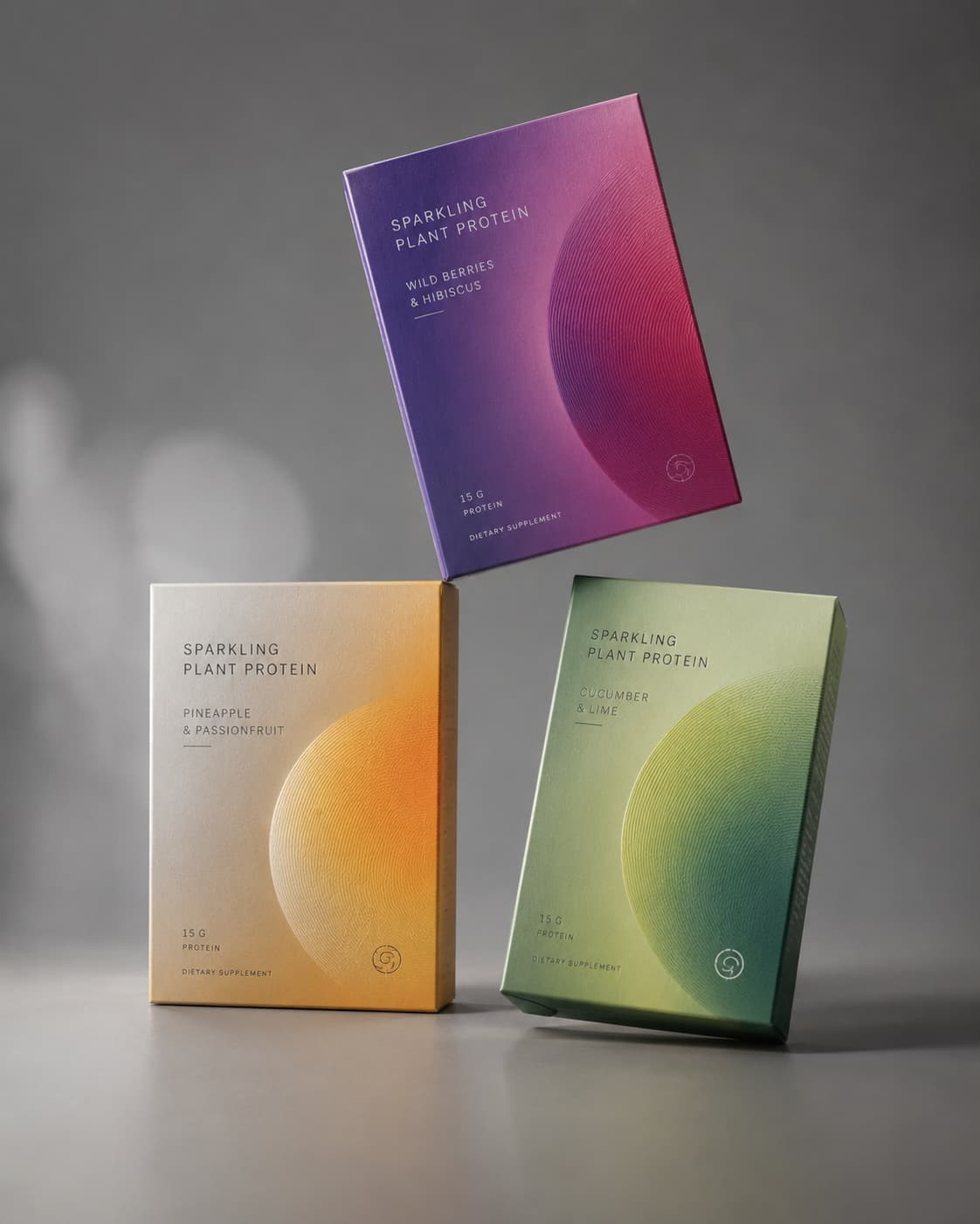
Colors play a crucial role in how consumers perceive cosmetic products. When you choose colors for your packaging, think about color symbolism and the emotional associations they carry. For instance, red often evokes passion and excitement, making it ideal for bold lipsticks. On the other hand, soft pastels like pink or lavender can convey gentleness and femininity, attracting a more delicate audience. Green suggests natural ingredients and eco-friendliness, appealing to health-conscious consumers. By understanding the psychology behind these colors, you can create a brand image that resonates with your target market. Remember, the right color choice not only catches the eye but also influences emotions, guiding consumers toward making a purchase decision. So, choose wisely!
Top Font Styles for Beauty Brands
When choosing the right font for your beauty brand, you want to ensure it complements your overall aesthetic and resonates with your target audience. Serif fonts can evoke a sense of sophistication, making them great for brands with vintage aesthetics. In contrast, sans serif fonts offer a clean, modern look that suits minimalist styles perfectly. If you’re aiming for elegance, script fonts add a touch of luxury and fluidity. For bold statements, bold typography can capture attention and convey confidence. Playful lettering works wonders for brands targeting a younger demographic, infusing fun into your packaging. Ultimately, your choice of font should reflect your brand’s personality and create a cohesive identity that stands out in the beauty industry.
Color Combinations That Captivate Consumers
The right color combinations can make your cosmetic packaging unforgettable and drive consumer interest. To stand out, consider using vibrant palettes that evoke emotion and energy. Bold colors like fuchsia, teal, or sunny yellow can attract attention and create a lively brand image. Pair these vibrant hues with minimalist aesthetics to strike a perfect balance; less can often be more. For instance, a striking coral against a clean white background can convey freshness and elegance. Alternatively, soft pastels combined with muted tones can provide a soothing feel, appealing to a more relaxed audience. By thoughtfully choosing your color combinations, you’ll not only enhance your packaging but also foster a deeper connection with your customers, making your brand memorable.
The Role of Typography in Brand Identity
Typography plays a crucial role in shaping your brand identity, influencing how consumers perceive your products. A well-established typography hierarchy directs attention to essential information, guiding customers through your brand’s message effortlessly. When you choose fonts that align with your brand’s personality, you enhance brand recognition and create a memorable experience. For instance, elegant script fonts might evoke luxury, while bold sans-serif fonts could suggest modernity and confidence. It’s essential to maintain consistency across all packaging materials, as this reinforces your brand identity. By balancing legibility and style, you can make a lasting impression. Remember, the right typography doesn’t just communicate information; it tells your brand’s story and connects emotionally with your audience, elevating your cosmetic packaging to new heights.
Current Trends in Cosmetic Packaging Design
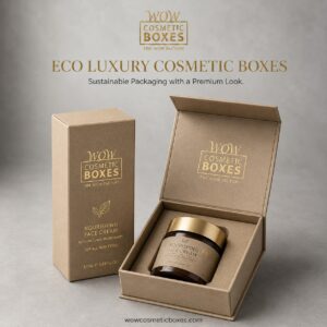
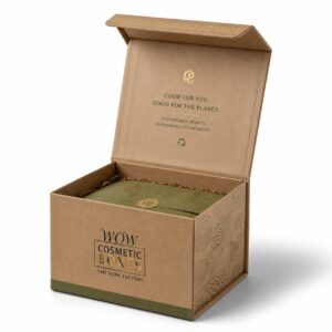
As consumer preferences evolve, staying ahead of current trends in cosmetic packaging design is essential for brands aiming to capture attention and drive sales. One prominent trend is the shift toward sustainable materials. More consumers are seeking eco-friendly options, so using recyclable or biodegradable packaging not only appeals to their values but also enhances brand loyalty. Additionally, minimalist designs are gaining traction. Clean lines and simple aesthetics create a modern look that resonates well with today’s audience. You’ll find that these designs often prioritize functionality, reducing excess waste while remaining visually appealing. By embracing sustainable materials and minimalist designs, you can effectively position your brand as innovative and responsible in a competitive market.
How the Right Fonts and Colors Make Cosmetic Packaging More Memorable
Fonts and colors are not just design choices in cosmetic packaging. They are powerful branding tools that help customers understand your product before they even read the details. In the beauty industry, customers often make quick decisions based on how packaging looks. A box that uses the right color palette, clean typography, and consistent branding can make a product feel premium, trustworthy, and professional.
For small beauty brands, this is especially important. Many startups do not have the same recognition as established cosmetic companies, so packaging has to do more of the work. A strong design can make a new product look more polished and ready for the market. This is why choosing fonts and colors carefully should be part of every packaging strategy.
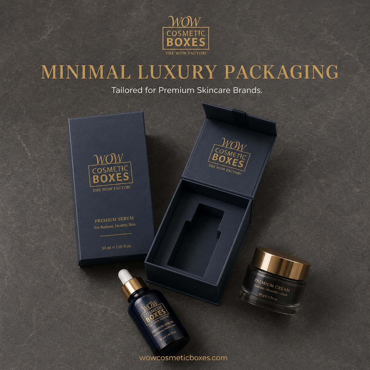
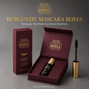
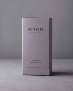
The first thing customers usually notice is color. Color creates emotion instantly. Soft pinks, creams, and nude tones often feel gentle, feminine, and elegant. Black and gold create a luxury feeling. Green and kraft tones can communicate natural, organic, or eco-friendly values. White packaging feels clean, modern, and skincare-focused. Deep colors like burgundy, navy, and emerald can make beauty products feel rich and premium.
When startups explore different cosmetic packaging ideas for startups, they should not choose colors only because they look nice. They should choose colors based on the type of customer they want to attract. A luxury skincare brand may need a calm and elegant color palette. A fun makeup brand may use brighter tones. A clean beauty brand may use soft neutrals, green accents, or kraft materials. The right color direction helps customers understand the brand personality immediately.
Fonts work the same way. Typography tells customers whether a brand is luxury, modern, playful, natural, or professional. Serif fonts often feel premium, classic, and elegant. Sans-serif fonts feel clean, modern, and minimal. Script fonts can feel feminine or artistic, but they should be used carefully because they can become hard to read. For cosmetic packaging, readability is very important. If customers cannot quickly understand the product name, shade, or benefit, the design may look attractive but fail to communicate clearly.
A good packaging design usually uses no more than two font styles. One font can be used for the brand name or product title, and another simple font can be used for product details. Too many fonts can make packaging look messy and unprofessional. Startups should aim for clean, balanced typography that makes the product easy to understand.
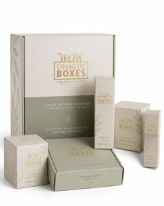
Consistency is another major factor. If every product uses different fonts and colors, customers may not recognize the brand. A strong cosmetic brand uses a consistent design system across all products. This means the logo placement, font style, color palette, and layout should feel connected. For example, if your serum boxes use white packaging with gold text, your cream boxes, lipstick boxes, and skincare packaging should follow a similar visual direction. This makes the brand look organized and more trustworthy.
Strong fonts and colors also help with online selling. Today, many customers discover cosmetic products on Instagram, TikTok, Pinterest, Google Images, and eCommerce stores. Packaging must look good in photos and videos. Clean fonts and strong color contrast make the product easier to notice in a feed. If the text is too small, too light, or too decorative, it may not stand out online. This is why brands should test how their packaging looks on both mobile screens and product photos.
For startups working with a limited budget, smart design choices can make packaging look premium without increasing cost too much. A simple box with one strong color, clear typography, and a well-placed logo can look better than an expensive design with too many details. Brands looking for cost-effective options can also explore affordable custom cosmetic boxes for startups to create packaging that looks professional without overspending.
Another important point is color contrast. The text must be easy to read against the background. Gold text on white can look luxury, but if the gold is too light, it may become difficult to read. Black text on kraft packaging creates a clean natural look. White text on dark boxes can feel bold and premium. The goal is to make the design beautiful but also practical.
Fonts and colors should also match the product category. Lipstick packaging often works well with bold, stylish, and fashionable design elements. Soft pinks, reds, burgundy, black, nude, and gold are strong choices for lipstick branding. If the blog already discusses product-specific design, you can naturally guide readers toward custom lipstick boxes for startups as an example of how color and typography can make makeup packaging more attractive.
Serum packaging usually needs a different approach. Since serums are seen as premium skincare products, the design should feel clean, scientific, trustworthy, and elegant. White, gold, soft green, beige, blue, or minimal black accents work well for many serum brands. If you mention skincare packaging, you can also link to custom serum boxes for startups to show how product-specific packaging can support a professional skincare brand.
The logo is also a key part of font and color strategy. A logo should be visible, balanced, and placed where customers can easily notice it. Many beauty brands choose custom cosmetic boxes with logo because logo packaging improves brand recognition and makes the product look more professional. When the logo uses the same colors and typography across all packaging, customers begin to remember the brand faster.
In the end, fonts and colors are not small details. They shape how customers feel about a product. The right combination can make packaging look premium, build trust, improve recognition, and support sales. For cosmetic brands, especially startups, choosing fonts and colors carefully can be the difference between packaging that looks ordinary and packaging that makes customers stop, look, and remember the brand.
Conclusion
In the world of cosmetic packaging, the right fonts and colors can make all the difference in how your brand is perceived. By understanding color psychology and choosing the perfect typography, you can create a compelling identity that resonates with consumers. Remember, first impressions are everything, so don’t underestimate the power of visual appeal. Stay ahead of the curve by keeping an eye on current trends, and your brand will surely shine in a competitive market.