Print clarity in cosmetic box design springs from several key elements that engage your customers. Quality materials, like smooth paper or textured finishes, amplify visual appeal. The printing techniques utilized—think offset or digital—help achieve crisp imagery. Vibrant colors and high-resolution images evoke emotion while enhancing readability. Design elements, including typography and layout, contribute greatly to clarity, ensuring your brand stands out. Don’t overlook the importance of finishing touches, like glossy coatings or embossing, which add a tactile layer of intrigue. Curious about how these factors intertwine to elevate your packaging? There’s so much more to uncover!
Main Points
- High-resolution images and vector graphics ensure crisp, professional designs that prevent pixelation and enhance print clarity in cosmetic boxes.
- Selection of high-quality materials, such as coated papers, improves ink adhesion and visual appeal, contributing to overall print clarity.
- Effective color contrast and saturation enhance readability and draw attention, making essential design elements stand out clearly.
- Stringent quality control processes, including regular inspections and color calibration, are crucial for maintaining high print clarity standards throughout production.
- Finishing options like matte or glossy coatings and embossing can add depth and vibrancy, enhancing the overall clarity and attractiveness of the packaging.
Importance of Print Clarity
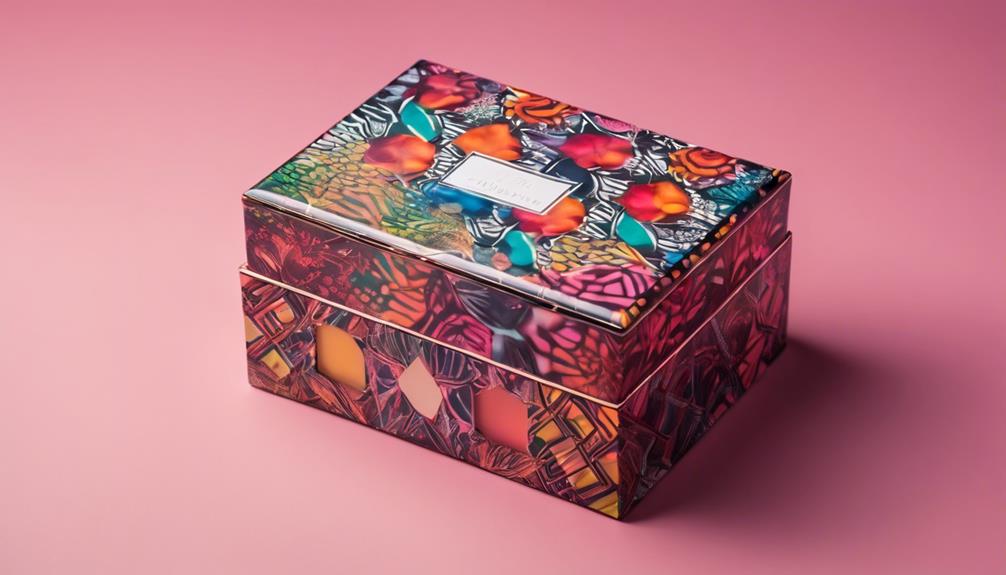
In today’s fast-paced world, where consumers are bombarded with countless product options, the importance of print clarity in cosmetic box design can’t be overstated. When you glance at a beautifully designed box, the clear, crisp print immediately captures your attention.
It’s not just about aesthetics; print clarity directly influences brand recognition. For instance, custom makeup kit boxes serve as a game changer in enhancing overall customer experience through distinctive designs. You can easily identify a trusted brand amidst a sea of choices, enhancing your shopping experience.
Furthermore, how the product is presented shapes consumer perception. If the print is sharp and legible, it conveys quality and professionalism, building trust in the brand.
Ultimately, effective print clarity transforms a simple box into a powerful marketing tool, ensuring your product stands out and resonates with consumers.
Material Selection
Choosing the right materials for cosmetic box design can make a significant difference in how your brand is perceived. The materials you select not only impact durability but also enhance print clarity, making your designs truly stand out.
For instance, the choice of material selection can directly influence the overall aesthetic and functionality of your packaging.
Consider the following elements when making your choices:
- Paper Types: Opt for high-quality paper that complements your product’s image.
- Coating Options: Matte or glossy finishes can dramatically change the visual appeal.
- Weight: Heavier stocks convey luxury, while lighter options may suggest eco-friendliness.
- Texture: Textured papers add tactile interest, making your boxes more engaging.
- Sustainability: Eco-friendly materials resonate with environmentally conscious consumers.
Printing Techniques
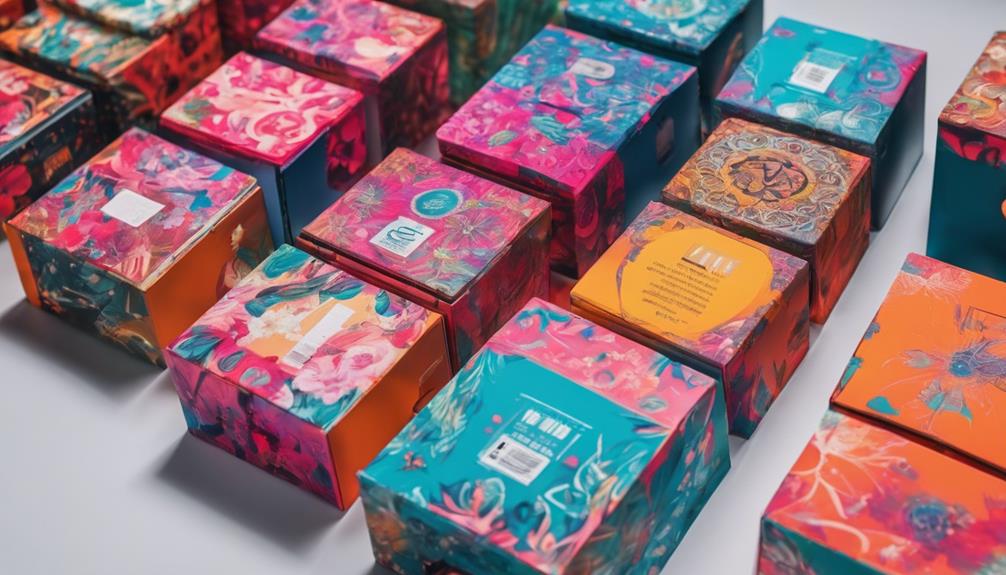
In relation to bringing your cosmetic box designs to life, the right printing techniques can truly make your visuals pop.
With offset printing, you get vibrant, high-quality images that capture attention, essential for showcasing the elegance of custom mascara packaging.
Digital printing offers flexibility and quick turnaround, perfect for unique designs.
If you’re aiming for bold graphics, screen printing stands out with its rich colors.
Flexographic printing is ideal for large runs, ensuring consistency across batches.
Employing lithographic techniques can add an elegant touch to your packaging.
Consider UV printing for a glossy finish that’s both durable and eye-catching.
To elevate your design, incorporate embossing techniques that create a tactile experience.
Color Quality
In regards to cosmetic box design, color quality can make or break your brand’s appeal. You want to captivate your audience with hues that resonate emotionally and stand out on the shelf.
Employing effective color contrast enhances readability and draws attention to key elements, while understanding color psychology helps convey your brand’s message. Utilizing custom printing options allows brands to showcase vibrant colors that enhance visibility and attract customers.
Consider these elements for ideal color quality:
- Vibrancy: Use saturated colors for a lively appearance.
- Contrast: Pair light and dark shades to highlight text.
- Harmony: Select complementary colors for a balanced look.
- Emotion: Choose colors that evoke the right feelings.
- Consistency: Maintain a cohesive palette across products.
Resolution and Detail
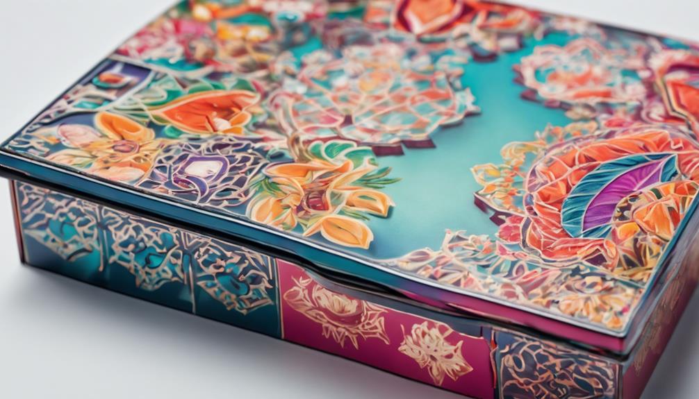
While color quality captures the eye, resolution and detail bring your cosmetic box design to life, ensuring that every element resonates with potential customers. Achieving crisp image sharpness is essential; it allows intricate details to pop, creating a visual feast that draws people in.
When you use high-resolution images, the result is a striking design that looks professional and polished. Opting for vector graphics enhances this effect, as they scale beautifully without losing clarity. This means your logos, patterns, and illustrations remain sharp and vibrant, no matter the size.
By focusing on these aspects, you elevate your packaging, making it not just an accessory, but a statement that reflects the quality of the product within.
Furthermore, incorporating custom packaging options can further enhance your brand’s visual appeal and market presence, making your product even more memorable.
Finishing Options
The finishing options you choose for your cosmetic box can transform an ordinary package into an extraordinary experience.
These finishing touches enhance not only the visual appeal but also the tactile sensation, making your product unforgettable.
By selecting the right surface textures, you can create an engaging unboxing experience that resonates with your customers.
Consider these options:
- Matte Finish: Offers a soft, elegant touch.
- Glossy Finish: Provides a vibrant, eye-catching shine.
- Embossing/Debossing: Adds depth and dimension to your design.
- Foil Stamping: Introduces a luxurious metallic sheen.
- Soft-Touch Coating: Creates a velvety feel that invites interaction.
Choosing the right finishing options can elevate your cosmetic box, making it a true reflection of your brand’s identity.
Design Elements
In the domain of crafting the perfect cosmetic box, design elements play a vital role in capturing attention and conveying your brand’s essence. Your typography choices can evoke emotions and set the tone, so select fonts that reflect your brand’s personality—elegant serif for luxury, or playful sans-serif for fun.
Pair these with striking colors that complement your products, enhancing overall appeal.
Imagery impact is equally significant; it should resonate with your audience and communicate the product’s benefits at a glance. High-quality visuals can create a lasting impression, making your box stand out on crowded shelves.
Together, these design elements not only enhance print clarity but also guarantee your cosmetic box tells a compelling story, inviting customers to explore inside.
Environmental Factors
Environmental factors greatly influence the effectiveness of your cosmetic box design. You mightn’t realize how much lighting conditions and humidity levels can impact print clarity.
When light hits your box, it can either enhance or diminish the vibrancy of your colors. High humidity can cause smudging or running ink, ruining your carefully crafted design.
Consider these aspects for ideal results:
- Positioning under natural light for true color representation
- Using moisture-resistant materials to combat humidity levels
- Testing prints in various lighting conditions
- Adjusting colors based on lighting to maintain vibrancy
- Storing boxes in climate-controlled environments
Quality Control Processes
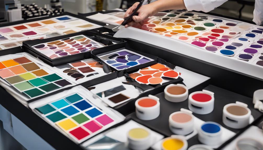
Guaranteeing impeccable print clarity in cosmetic box design hinges on robust quality control processes that catch potential issues before they reach the consumer.
You’ll want to implement stringent quality assurance measures at every step. Start with meticulous inspection methods, examining each print sample under bright lights to reveal any smudges or misalignments.
Utilize color calibration tools to guarantee vibrant hues stay true to your design vision. Regular audits of production runs help you identify patterns of inconsistency, allowing for immediate adjustments.
Don’t overlook feedback loops, as they bring insights from your team directly into the quality control conversation.
