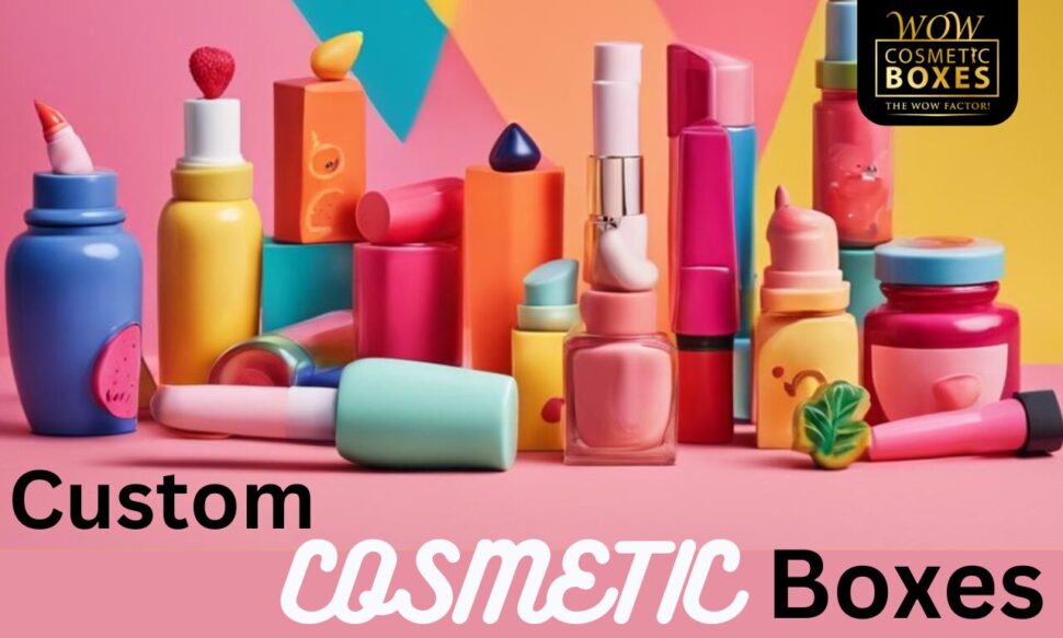
When you think about cosmetic packaging, do you ever consider how color choices impact your feelings and decisions? Each hue carries its own emotional weight, influencing how you perceive a brand and its products. From the energizing pull of red to the calming embrace of pastels, these colors can either attract or repel potential buyers. Understanding this connection is essential for brands aiming to stand out in a crowded market. So, how do companies strategically select colors to evoke specific reactions and drive sales? The answer might surprise you.
Main Points
- Color evokes emotions that significantly influence consumer behavior, making it essential for effective cosmetic packaging design.
- Vibrant colors attract attention and excitement, while softer tones promote calmness and sophistication in branding.
- Custom packaging utilizes strategic color choices to reflect brand identity and enhance emotional connections with consumers.
- Case studies demonstrate that brands like Chanel and Maybelline successfully use color psychology to enhance their appeal and consumer loyalty.
- Understanding color associations, such as pink for femininity and green for sustainability, helps tailor packaging to target demographics.
Importance of Color in Branding
When you consider how a brand makes its first impression, color plays an essential role in capturing attention and evoking emotions. The right colors can instantly convey a brand’s identity and values, making it significant for cosmetic packaging design.
Think about how vibrant hues can suggest excitement and energy, while softer tones evoke calmness and sophistication. Utilizing color effectively not only attracts potential customers but also builds brand recognition and loyalty.
Custom Makeup Kit Boxes are a perfect example of how tailored designs can enhance overall consumer experience. A well-chosen color palette creates a visual language that resonates with your target audience, guiding their purchasing decisions.
Don’t underestimate the impact of color—it’s a powerful tool that can differentiate your brand in a crowded market, making it memorable and appealing. Embrace color to elevate your packaging and brand success!
Emotional Responses to Colors
Colors consistently evoke powerful emotional responses that can influence consumer behavior in the cosmetic industry. When you see vibrant reds, you might feel excitement and passion, drawing you toward that bold lipstick.
Soft pastels might evoke feelings of calm and serenity, making that delicate blush seem irresistible. Custom packaging options, such as custom designs, can further enhance these emotional connections, allowing brands to create a unique identity that resonates with their audience.
Think about how these colors can create an instant connection; they tap into your emotions and desires. A well-chosen color can make you feel youthful, confident, or even glamorous.
By understanding these emotional triggers, brands can design packaging that resonates deeply with you, enhancing your shopping experience.
Color Associations in Cosmetics
Understanding how colors influence emotions is just the beginning; the associations tied to those colors play a significant role in cosmetic packaging design.
Custom packaging, such as custom lip gloss boxes, allows brands to reflect their unique identity through color choices. When you see vibrant pinks, you might think of femininity and playfulness, drawing you into the world of beauty.
Earthy greens often evoke feelings of natural ingredients and sustainability, appealing to eco-conscious consumers like you. Meanwhile, sleek blacks and whites can suggest luxury and sophistication, making you feel a sense of exclusivity.
Case Studies in Color Psychology
Color psychology isn’t just theory; it’s a powerful tool that brands leverage to connect with consumers on a deeper level.
For instance, in the cosmetic industry, packaging plays a vital role in attracting attention and conveying brand values, just like custom beard oil packaging solutions enhance brand aesthetics.
Take a look at these compelling case studies:
- Chanel No. 5: The iconic gold and black packaging evokes luxury and sophistication, reinforcing the brand’s timeless appeal.
- Maybelline: With bold reds and vibrant blues, Maybelline’s packaging attracts younger consumers, aligning with their energetic and trendy image.
- L’Oreal: The sleek, modern packaging in muted tones speaks to professionalism and reliability, appealing to a more mature audience.
These examples show how color can enhance brand identity and influence purchasing decisions.
Tips for Effective Color Usage
In regards to creating packaging that stands out, choosing the right colors can greatly boost your brand’s appeal. Start by understanding the emotions associated with different colors—blue conveys trust, while red evokes excitement.
Moreover, consider how your color choices can enhance your packaging type, such as using bold colors for rigid boxes to convey a premium feel. Use a limited color palette to maintain visual cohesion; too many colors can overwhelm potential customers.
Consider your target demographic and their preferences; younger audiences might prefer vibrant hues, while older consumers may lean towards muted tones.
Don’t forget to test your color choices; what looks good on screen may not translate well to print. Finally, verify that your colors reflect your brand’s identity.

