When you think about custom cosmetic box design, it’s easy to overlook how color choices can greatly influence consumer perception. You might not realize that each hue carries unique emotional weights—like how red can evoke excitement while green often suggests tranquility. By understanding these nuances, you can craft packaging that resonates deeply with your target audience. But what happens when the wrong colors are chosen? The implications might be more profound than you expect, leading to a cascade of effects on brand perception and sales.
Main Points
- Color psychology significantly affects consumer emotions and behaviors, making it crucial for effective cosmetic packaging design.
- Choosing colors that resonate with target audiences enhances brand identity and creates a memorable experience.
- Warm colors like red and orange stimulate excitement, while soothing colors like blue and green promote relaxation and trust.
- Consistent color palettes can improve brand recognition by up to 80%, fostering loyalty and encouraging repeat purchases.
- Cultural differences must be considered in color selection to ensure appropriate brand perception across diverse consumer groups.
Understanding Color Psychology
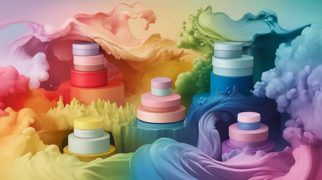
Understanding color psychology is essential for brands aiming to create impactful cosmetic packaging. By grasping how colors influence emotions and behaviors, you can design custom cosmetic boxes that resonate with your target audience.
Each color evokes specific feelings; for instance, red ignites excitement, while blue fosters trust. Incorporating design considerations such as branding and artwork into your color choices enhances the overall appeal.
When selecting colors for unique cosmetic packaging, consider the emotional responses they invoke, as these can greatly affect purchasing decisions. Soothing shades like blue and green work well for relaxation products, while vibrant hues like pink can attract younger consumers.
Furthermore, keep cultural differences in mind, as color meanings can vary across regions, shaping how your brand message is perceived. This knowledge helps you effectively communicate your product’s essence.
Colors and Their Meanings
Colors play an important role in cosmetic packaging, as they can considerably influence consumer perceptions and emotions. When designing custom packaging for beauty products, it’s crucial to choose colors that resonate with your target audience.
For instance, pink often appeals to younger female consumers, symbolizing femininity and playfulness. Moreover, utilizing custom makeup kit boxes can enhance the overall customer experience by incorporating colors that align with brand identity.
Purple conveys luxury and creativity, attracting those seeking high-end items. Black signifies elegance and sophistication, perfect for premium cosmetics. White represents simplicity and purity, suggesting quality in custom cosmetic packaging.
Choosing the Right Colors
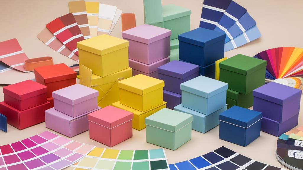
When selecting the right colors for your cosmetic box design, it’s essential to contemplate your target audience’s preferences and the emotions you want to evoke.
For instance, if you’re creating custom packaging for organic cosmetics, shades of green can emphasize health and eco-friendliness. Utilizing high-quality materials can also support your color choices, ensuring that the vibrant hues stand out effectively.
For vibrant, youthful beauty brands, warm colors like red and orange can generate excitement. If your aim is luxury, a minimalist palette featuring black and white can convey elegance.
Consistency in color across your custom boxes for beauty brands enhances brand identity, making your products easily recognizable.
Don’t forget about custom printed labels for cosmetics; they should also reflect your selected color scheme to create a cohesive visual experience that resonates with consumers.
Impact on Consumer Behavior
The colors you choose for your cosmetic box design can profoundly impact consumer behavior and purchasing decisions. Research shows that 85% of consumers base their buying choices on color alone, making it critical for custom cosmetic packaging.
Custom packaging that incorporates appealing colors enhances brand visibility, making products stand out on shelves and attracting immediate attention. Warm colors like red and orange can trigger impulse buying, ideal for brands wanting to attract immediate attention.
If you’re targeting female consumers, pink can foster emotional connections, reflecting femininity and youthfulness. Conversely, blue conveys trust and reliability, enhancing brand loyalty, especially in custom packaging for skincare products.
Additionally, a cohesive color palette aligned with your brand identity can boost recognition by up to 80%, reinforcing the importance of strategic color choices in your cosmetic packaging design.
Custom colors also complement custom branding elements like logos and slogans, further enhancing the overall appeal.
Case Studies and Examples
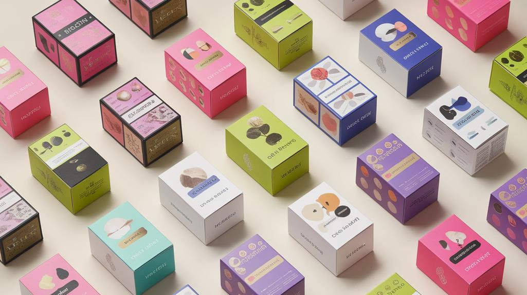
Several brands have effectively harnessed color psychology in their cosmetic box designs to create strong emotional connections with consumers. For instance, Dove’s use of soft whites and pastels conveys nurturing qualities, appealing to those seeking gentle products. This approach aligns with the concept of enhanced branding opportunities, where personalized designs increase market visibility.
In contrast, MAC Cosmetics employs bold black and red packaging, projecting confidence and energy for a younger audience. Clinique’s green packaging emphasizes health and purity, aligning with their allergy-tested messaging. Estée Lauder’s deep blues and luxurious golds evoke trust and opulence, solidifying their premium status.
Conclusion
To sum up, understanding color psychology is essential for creating effective custom cosmetic box designs. By choosing the right colors, you can evoke emotions and align your brand with your target audience’s preferences. This strategic approach not only enhances product visibility but also builds strong emotional connections, ultimately impacting consumer behavior. As you consider your design, remember that the right color palette can set your brand apart and foster loyalty in a competitive market.
