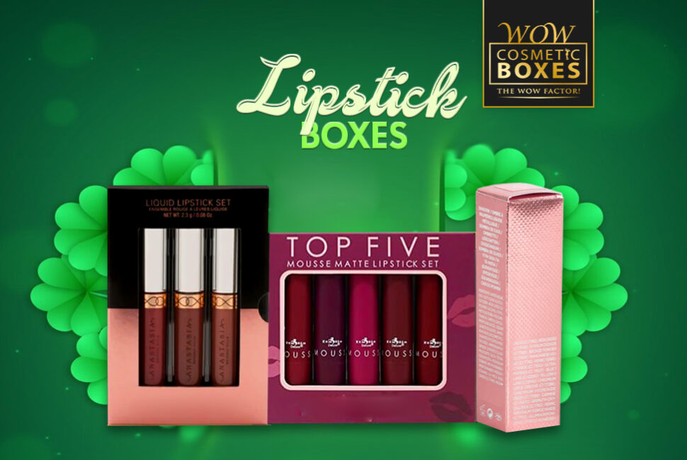
One of the most integral design elements in the packaging design is the colors. With so many choices, it can be tricky to choose the perfect color scheme for your Lipstick Boxes. Specific colors evoke different actions, emotions, and responses. So it is essential to make the right choice. Using the right colors can increase engagement, brand recognition, and product sales. Ensure you are picking something which complements your product and brand. There are endless choices when it comes to choosing colors for your cosmetic packaging. But it is essential to stick to two or three colors. If it is your first time choosing the packaging colors, follow the below tips to make a perfect choice
Match Lipstick Boxes Color to Your Brand
The first thing you can do when designing Lipstick Boxes is picked a color that matches your brand. The color should match the other elements of your packaging, such as product labels and caps. It should also match any other promotional material you plan on using for this product (such as brochures or advertisements). The primary colors of your logo should be in your packaging design as well as the secondary ones if they fit into the scheme.
Use A Color Wheel While Designing Lipstick Boxes
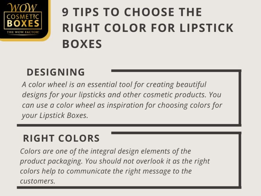
A color wheel is an essential tool for creating beautiful designs for your lipsticks and other cosmetic products. You can use a color wheel as inspiration for choosing colors for your Lipstick Boxes. It shows you how different colors can be combined using different hues and shades. You can choose from thousands of different colors, but it is best to stick with just a few so that the result looks polished and professional instead of cluttered or confusing.
Stick to Two or Three Colors for Lipstick Boxes
Unless you are going for a bold and vibrant feel, avoid using too many colors for the Lipstick Boxes. Excessive use of colors will only make the design complex and unpleasant. Always pick two or three colors while designing cosmetic packaging. It will make you’re your design look clean and appealing. If you want to go for some additional colors, add texture for toning down. It will help to achieve the right contrast. Look at your current color scheme and cut down some colors.

Consider Using Natural Colors for the Soap Boxes
Human nature is inspired by natural colors. It is best to take inspiration from the surroundings while designing Soap Boxes. Nature is the biggest source of some amazing colors. When it comes to finding inspiration online, you can stuck due to limited choices. Take a look outside your window, and you will find some amazing color combinations. We are not saying to copy the exact colors. It is all about taking inspiration and coming up with your creative idea.
Look For Trends While Designing the Soap Boxes
It is always good to keep an eye on the colors which are in trend in the cosmetic industry. As we are in the middle of 2022, customers are more into bold and vibrant colors. Natural and light shades are the perfect choice for Soap Boxes. Pink and purple are two most of the used colors in the soap industry. Black and white are the best choices for a standout design. Remember, colors can play a huge role in selling your product.
Think About the Emotions before Choosing Colors for Soap Boxes
Each color gives a different vibe and evokes different emotions. Colors and emotions are related to each other, and it is a fact. It is all about how well you understand color psychology. Some colors make you feel a certain way, and some make you sad. Red, yellow, and oranges are warm while blue, purple, and green are cool. Using warm colors for Soap Boxes make customers feel adoring and eager. Choose colors according to the emotions you want to evoke.

Complement Your Product with the Right Colors for Cosmetic Boxes
Colors are one of the integral design elements of the product packaging. You should not overlook it as the right colors help to communicate the right message to the customers. When you are selling cosmetic items, always choose colors that complement the inside content in the best possible way. If you are selling bold color eyeshades, choose colors for Cosmetic Boxes accordingly. Light shades are perfect for organic cosmetic items. If your product is more on the fun side, bold hues are the way to go.
Try Different Color Schemes for the Cosmetic Boxes
If you are selling more than one kind of product, sticking to one color scheme is not a good idea. There are many options you can try to stand out. Having a split and complementary color scheme is one of the many choices. Each color scheme has a different visual appeal and can attract a big audience. When it comes to designing Cosmetic Boxes, don’t be afraid to play with colors. Playing with endless possibilities will only make you better at choosing colors.
Don’t Stop To Explore Different Options for Cosmetic Boxes
Your present color scheme is helpful when the design process starts, but you should not stop exploring different options. Use the above tips to create your color scheme for the Cosmetic Boxes. You can pick only one color at the first step and start from there. Going for too many colors at once will only make things difficult for you. Taking a minimal approach is the best ideal to come up with a perfect color scheme.